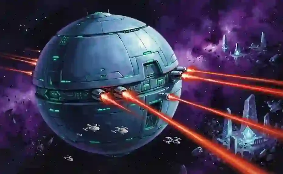
You have seen the covers. Massive spherical ships dwarfing star fleets. Alien emperors staring with cold, ancient eyes. Yet, you struggle to articulate why the art of the Arkon System feels different from all other science fiction. The problem is that most analysis stops at “retro spaceships,” ignoring the profound visual language that built the largest science fiction series in history. Fear not. This guide dissects the specific aesthetic rules, the key artists, and the historical context that defines Perry Rhodan Arkon system art, making you an expert on the subject.
The Historical Foundation of Arkonide Aesthetics
The visual representation of the Arkon Empire began in 1961 with the launch of the Perry Rhodan series. The early artwork, primarily produced for the German market by Heinrich Bauer Verlag, established a visual shorthand that persists today. Unlike the gritty, utilitarian look of American sci-fi of the era, the Perry Rhodan Arkon system art focused on elegance, symmetry, and immense scale.
The first major depiction of the Arkonide civilization came from Johnny Bruck. He defined the look of the Arkonides themselves: pale-skinned, white-haired, with distinct red albino eyes. Bruck’s painted covers for the “Cycle of the Arkon Empire” set the standard. He rendered their technology as a mix of organic curves and crystalline structures. The ships were not just machines; they were floating fortresses of light.
Before the advent of digital rendering, these artists worked with gouache and acrylics. This physical media gave the Perry Rhodan Arkon system art a tangible texture. The brush strokes created a sense of atmosphere and vastness that modern vector art often lacks. The original paintings are now highly sought-after collector’s items, valued for their historical significance and raw artistic energy.
Key Artists Who Defined the Arkon Look
Several masters shaped the visual identity of the Arkon System. Understanding their unique contributions is essential for any collector or art enthusiast.
Johnny Bruck (1961–1995): Bruck is the undisputed architect of the Perry Rhodan visual universe. He produced over 2,000 cover images. His interpretation of the Arkon Empire was revolutionary. He portrayed the Arkonides as a decaying, decadent species. His backgrounds often featured massive, empty throne rooms or endless star fields, emphasizing the loneliness of the empire. His Perry Rhodan Arkon system art is characterized by high contrast lighting and dramatic compositions.
Alfred Kelsner (1960s–1970s): While Bruck handled most covers, Kelsner was a master of technical illustration. His cutaway drawings and blueprints of Arkon spaceships and weaponry added a layer of realism. Kelsner’s meticulous detail work influenced how fans perceived the internal workings of the Empire’s technology. He treated the fictional tech with engineering precision.
Dirk Schulz (2000s–Present): Schulz modernized the franchise. His digital paintings brought a cinematic quality to the series. For modern Perry Rhodan Arkon system art, Schulz relies on dynamic lighting and massive particle effects. He respects the legacy designs but injects a sense of speed and motion that the older static paintings did not have. His work on the “Arkonia” cycles blended the classic spherical hulls with complex greebles and lighting rigs.
Deciphering the Architectural Language of the Arkon System
The Arkon Empire is ancient. The art reflects a culture that has mastered physics and moved beyond the need for aerodynamic design. Their structures speak of power and permanence.
The most famous architectural motif is the giant sphere. The Arkonides and the Imperium class ships are perfect spheres. Why? The artistic logic is that a civilization with unlimited energy does not need to worry about friction or aerodynamics. The sphere represents the most efficient volume for a shield emitter.
You will notice a prevalence of “crystal gardens” and vast, empty plazas in the backgrounds. The artists use these elements to convey scale. A single human figure standing before a towering Arkon statue instantly communicates the insignificance of Earth versus the Empire. The Perry Rhodan Arkon system art uses these artistic tricks to build the lore visually.
The Color Palette of an Ancient Empire
Color theory is crucial in distinguishing Arkon technology from Terran technology. The artists use specific colors to signal allegiance and technology levels.
Arkon tech is typically rendered in cool, metallic tones. Think platinum, steel blue, and deep emerald green. The energy weapons of the Arkon Fleet are almost always depicted as bright red or orange beams. This contrast—cold metal versus hot energy—creates visual tension.
The interior lighting is often purple or violet. This choice in Perry Rhodan Arkon system art suggests royalty and mystery. In contrast, Terran ships are usually painted white or grey with blue accents, signifying a younger, more optimistic civilization. When you look at a scene, the color tells you who is in charge before you even see a character.
The Evolution of the Combat Scene
Early covers focused on static displays of power. A ship would simply float in space, radiating menace. As the series progressed, the art became more dynamic.
The Dogfight Era: By the 1980s, the covers featured chaotic battles. You see overlapping spheres, shattered hulls, and laser fire intersecting. The Perry Rhodan Arkon system art of this era emphasizes the massive size of the Arkon fleet. A battle isn’t just a dogfight; it is a wall of metal stretching to the horizon.
The Diorama Era: Modern covers often use 3D rendering. Programs like Cinema 4D and Blender allow artists like Schulz to create complex lighting scenarios. The “art” is now in the composition and post-processing. The focus remains on the Arkon spheres, which serve as the anchor points for these massive battle scenes.
Perry Rhodan Arkon System Art and the Visual Encyclopedia
The Perry Rhodan universe has expanded beyond the main series. Spin-offs like Atlan and the Perry Rhodan Report books have featured their own distinct takes on the Arkon system.
The Perry Rhodan Report volumes, particularly the ones focusing on the early cycles, act as a visual encyclopedia. These books are gold mines for Perry Rhodan Arkon system art. They feature technical blueprints, costume designs, and planetary maps. The maps of the Arkon System show a triple star system, a detail that often confuses fans who only look at the covers. The art in these reports clarifies the geography of the “Great Empire.”
The “Arkon Empire” art books, published in the last decade, compile the best paintings from the archives. They offer high-resolution scans of Bruck’s original works, allowing you to see the canvas texture and the painter’s corrections. These compilations are the definitive reference for anyone studying the visual history.
Where to Source and Evaluate Original Works
Collecting original Perry Rhodan Arkon system art requires diligence. Original covers by Johnny Bruck occasionally appear in German auction houses specializing in fantastic art. Prices vary wildly based on the issue number and the prominence of the ship on the cover.
Here is a guide to evaluating a piece:
- Provenance: Look for authentication from the publisher or the Bruck estate.
- Medium: Bruck worked primarily on illustration board with gouache. Look for paint buildup.
- Subject: Covers featuring the Arkon flagship or iconic scenes command higher premiums.
- Condition: UV damage is common. Check for fading in the purple and blue pigments.
If original paintings are out of reach, limited edition prints are available. The publisher occasionally releases signed giclée prints of classic covers. These are excellent entry points for new collectors of Perry Rhodan Arkon system art.
The Role of the Arkon System in Modern Graphic Design
The influence of this aesthetic extends beyond the books. The clean, geometric approach has influenced video game design. Games like Stellaris and Homeworld owe a visual debt to the Arkon look.
Graphic designers often reference the Perry Rhodan Arkon system art when tasked with creating “ancient but advanced” technology. The use of large, unbroken surface areas with high-contrast panel lines is a hallmark of this style. It communicates that the technology is so advanced it appears simple. The “Greeble” technique—adding random surface details—is used sparingly here, because the Arkon look is smooth and pristine.
A Detailed Comparison of Visual Eras
Understanding the shifts in artistic direction helps you date a piece of art instantly.
| Era | Primary Artist | Visual Characteristics | Typical Scene |
|---|---|---|---|
| 1960s (Golden Age) | Johnny Bruck | Painterly, loose brushwork, muted colors, high contrast | Lone spheres floating, static portraits of Atlan |
| 1970s (Pulp Era) | Johnny Bruck | More dynamic angles, vibrant reds/oranges, alien landscapes | Explosions, space battles, discovery of artifacts |
| 1980s (Technical Era) | Johnny Bruck/Alfred Kelsner | Cleaner lines, technical accuracy, detailed schematics | Cutaways, fleet formations, station construction |
| 2000s (Digital Era) | Dirk Schulz | 3D rendering, cinematic lighting, particle effects, realism | Massive fleet battles, planetary invasions, epic scale |
This table provides a quick reference for identifying the era of a specific piece of Perry Rhodan Arkon system art.
The Impact of the Arkon Style on Other Media
The visual language of the Arkon System did not stay confined to Germany. It influenced international sci-fi aesthetics. The concept of the “city-ship” and the “battle-moon” can be traced back to the covers of the 1960s and 1970s.
Filmmakers and concept artists have admitted to borrowing from these themes. The design of the “Vorlon” ships in Babylon 5 shares similarities with the organic-organic-mechanical blend found in Arkon art. The idea of a ship that is a work of art itself is central to the Arkon design philosophy. The Perry Rhodan Arkon system art teaches us that a starship should be beautiful, not just functional.
How to Identify Authentic vs. AI-Generated Art
With the rise of AI image generators, the market is flooded with “fake” retro sci-fi. However, trained eyes can spot the difference.
Authentic Perry Rhodan Arkon system art has intentionality. Bruck’s spheres are geometrically perfect because he used a compass or a template. AI often renders spheres slightly distorted or with inconsistent reflections. The lighting in a Bruck painting follows a physical logic. If the star is on the left, the shadows fall to the right. AI often creates “mushy” lighting with no single source.
Also, look at the details. Bruck painted the weapon emitters and sensor arrays in specific, repeating patterns. AI tends to generate random noise in these areas. When looking at a piece, ask yourself: “Does this structure make sense?” If it doesn’t, it is likely not from a human master of Perry Rhodan Arkon system art.
Frequently Asked Questions
What mediums are used for original Perry Rhodan Arkon system art?
The original classic pieces were almost exclusively painted using gouache on illustration board. Modern pieces are created digitally using painting software like Photoshop or 3D programs like Cinema 4D, which are then printed.
Where can I buy vintage Perry Rhodan art prints?
You can purchase vintage prints from German online retailers specializing in science fiction memorabilia. Additionally, auction houses like Sotheby’s occasionally feature lots under “Vintage European Pulp Art.” Always verify the print quality and edition size before buying.
Who is the most famous artist for the Arkon System?
Johnny Bruck is the most famous artist. He painted the vast majority of the covers from 1961 until his death in 1995. His interpretation of the spherical spaceships and the albino Arkonides cemented the visual identity of the franchise.
How did the Arkon art style change in the digital era?
The style became more cinematic. Artists like Dirk Schulz introduced atmospheric perspective and volumetric lighting. While the old art was flat and graphic, the modern Perry Rhodan Arkon system art looks like stills from a high-budget science fiction film.
What distinguishes Arkon visual design from Terran design?
Arkon design features spherical ships, crystalline structures, and purple or emerald lighting. It relies on clean, imposing surfaces. Terran design features angular ships, visible engines, and utilitarian white/grey paint schemes. Terran tech looks built; Arkon tech looks grown.
Why are spheres so common in Arkon system art?
Spheres represent the pinnacle of efficiency for a civilization that has mastered gravity control. A sphere provides the maximum interior volume for the minimum surface area. This allows for the largest possible defense screens and the most efficient distribution of internal systems.
The Call to Collect and Explore
The visuals of the Arkon System are more than just backgrounds. They are the primary vehicles for the story’s tone. They tell a story of decay, incredible age, and fading glory. By studying the Perry Rhodan Arkon system art, you gain a deeper appreciation for the narrative. You understand why the Arkonides are stagnant—their art and architecture are too perfect to improve upon.
Do not let this visual history pass you by. Open an art book from the 1970s. Look at the geometric perfection of a Bruck original. Compare it to the digital bombast of today. You will see the evolution of science fiction itself. Your collection—or your appreciation—will be richer for the journey. Start your exploration of the Empire today.